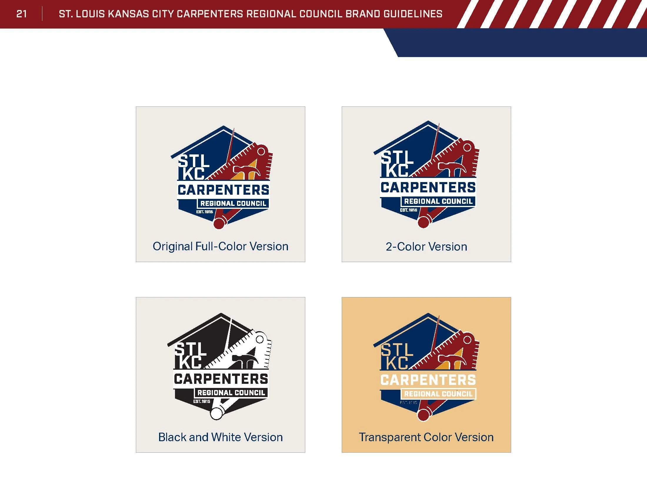
Client selected logo, designed by Candice Hendrickson.
St. louis-kansas city carpenters regional council REBRAND
Lead Designer, Art Direction, Brand Identity, Copywriting // Illustrator, XD, InDesign, Photoshop
Award of Excellence: Constructing the STLKCCRC Brand
Category: Campaign-Branding
Issued by Communicator Awards · January 2022
St. Louis Kansas City Carpenters Regional Council (STL-KC CRC) wanted to recruit new talent for their organization that was founded in 1882. We needed to modernize their brand to attract the next generation of carpenters. The council presented us with their new mission: “Improving Lives. Building Communities.” We took their mantra, coupled with the council’s desire to pay tribute to the history of the existing logo, updated the existing logo, and created a new logo, as well.
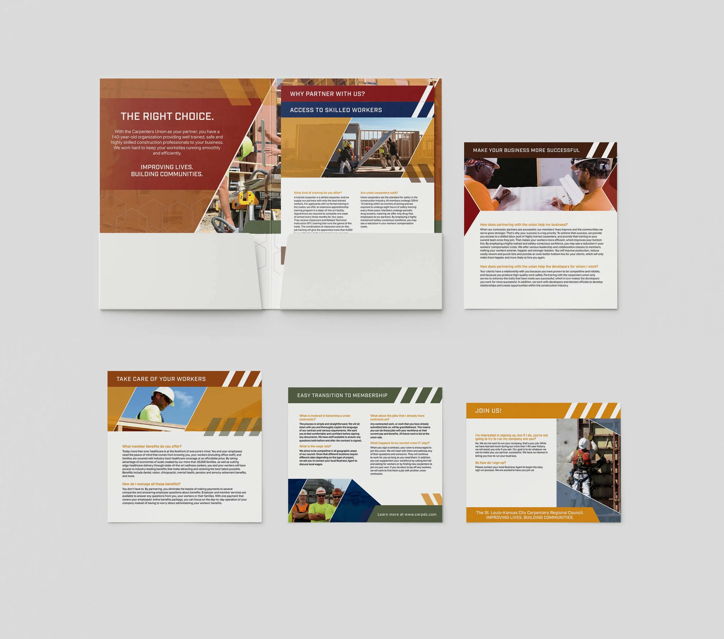
With prior experience in rebrands and the creation of brand guidelines, I led the creative and art direction for this initiative. In addition to creating the brand guide, I also created several other marketing materials for the rebrand campaign, including a stacked folder for prospective members, brochures, business card, an envelope, letterhead, print ad, display ads, iconography, and an additional logo.
One of my explorations of the logo.
One of my explorations of the logo.
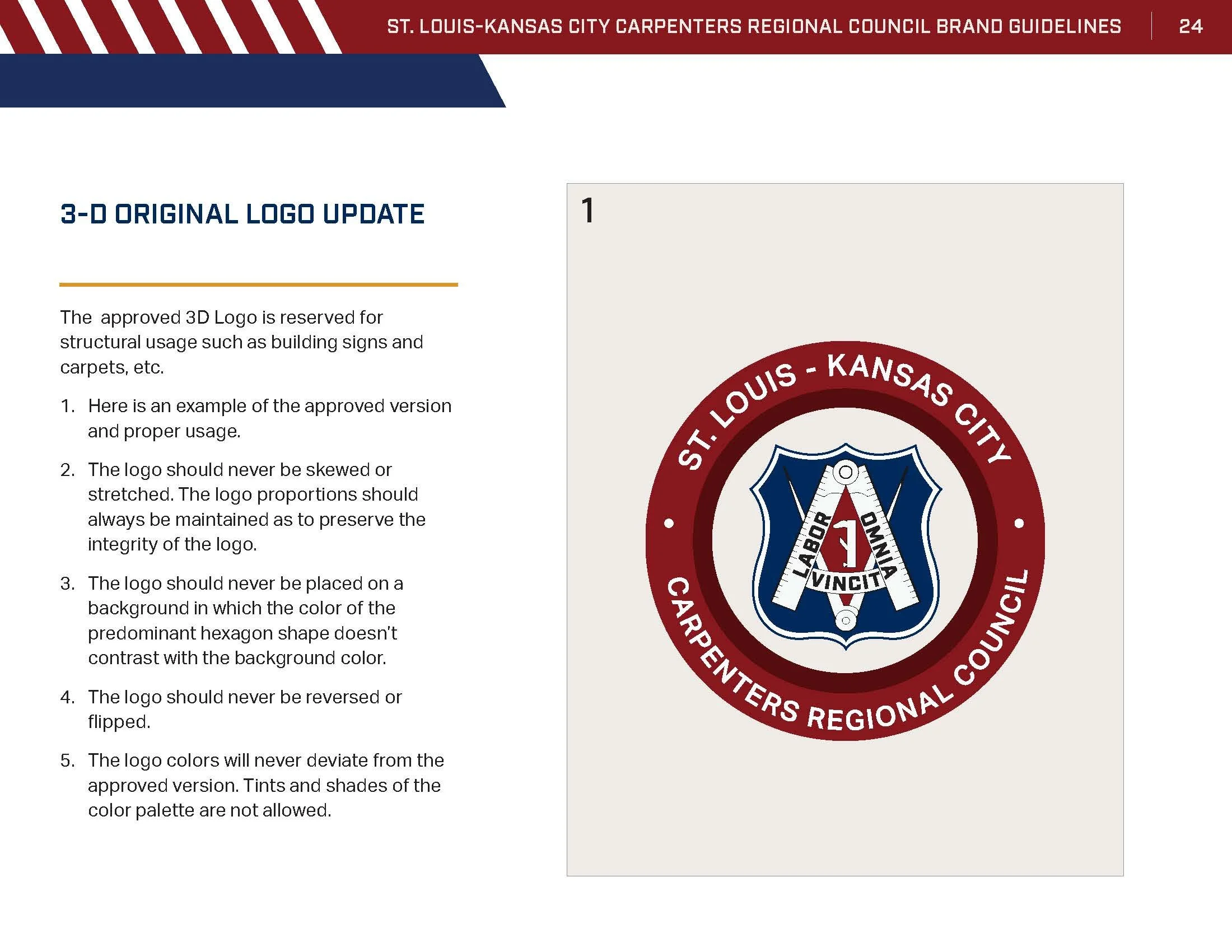
Original St. Louis - Kansas City Carpenters Regional Council Logo
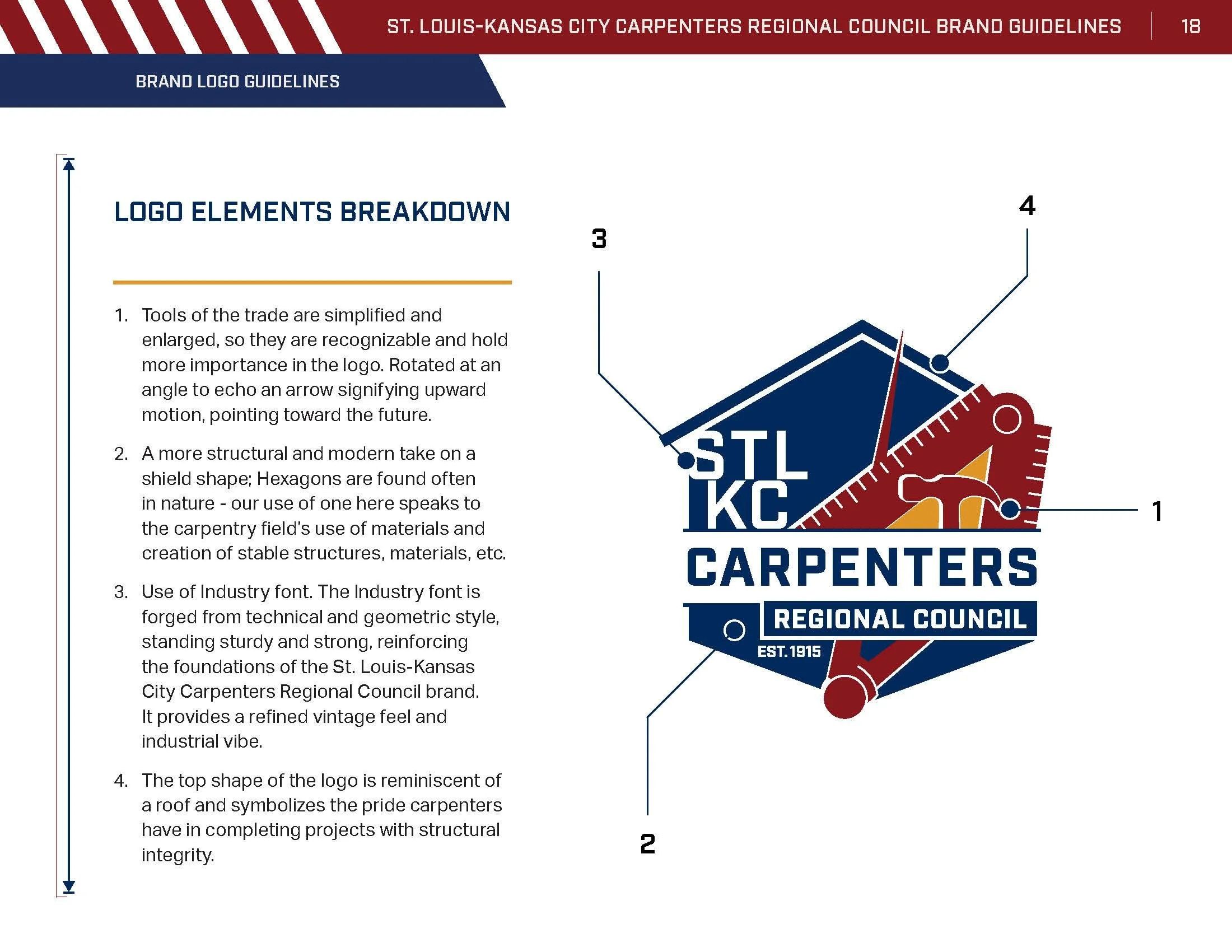
Refreshed and updated St. Louis - Kansas City Carpenter’s Regional Council Logo, paying homage to the original, modernized by me.
APPROACHING THE GUIDE
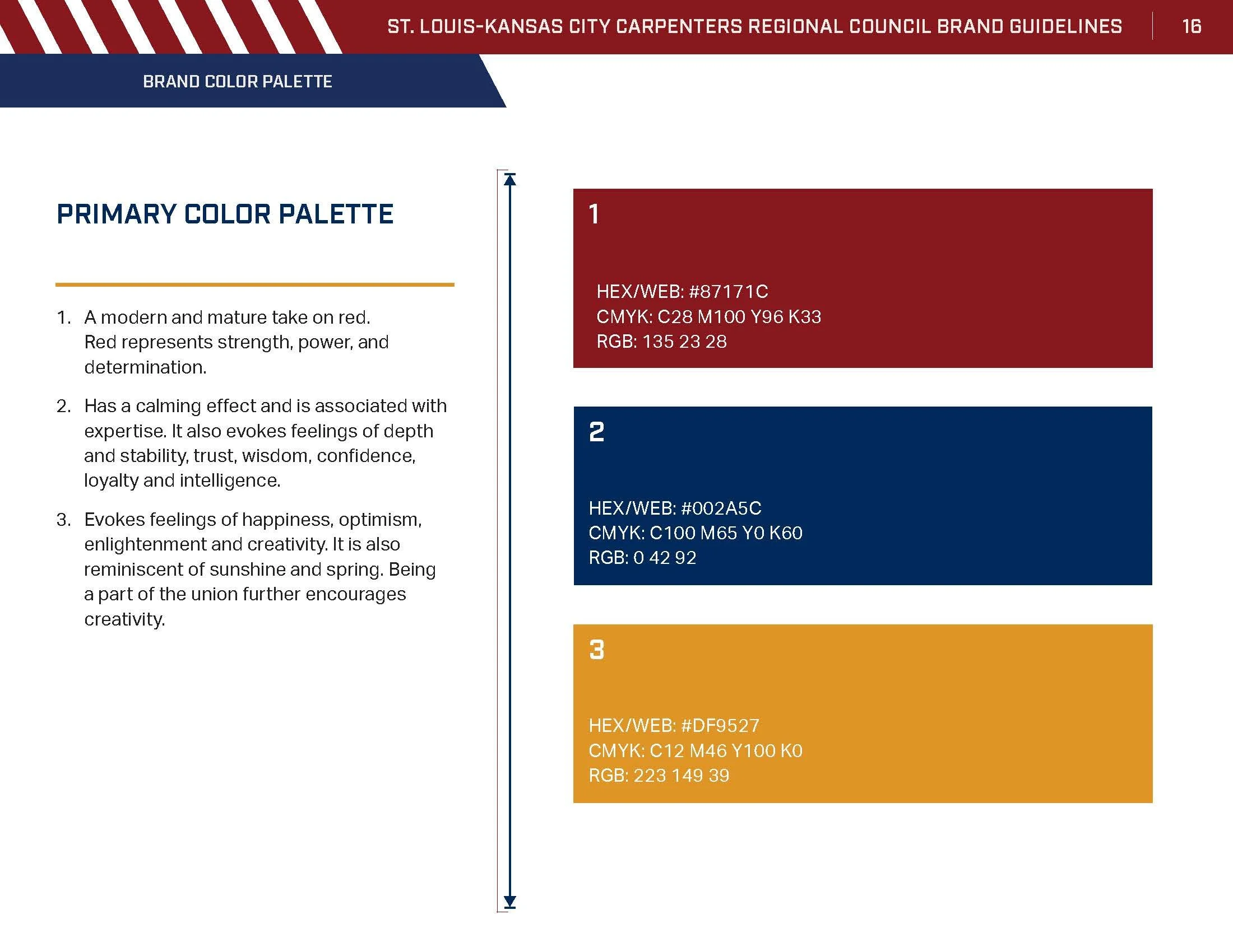
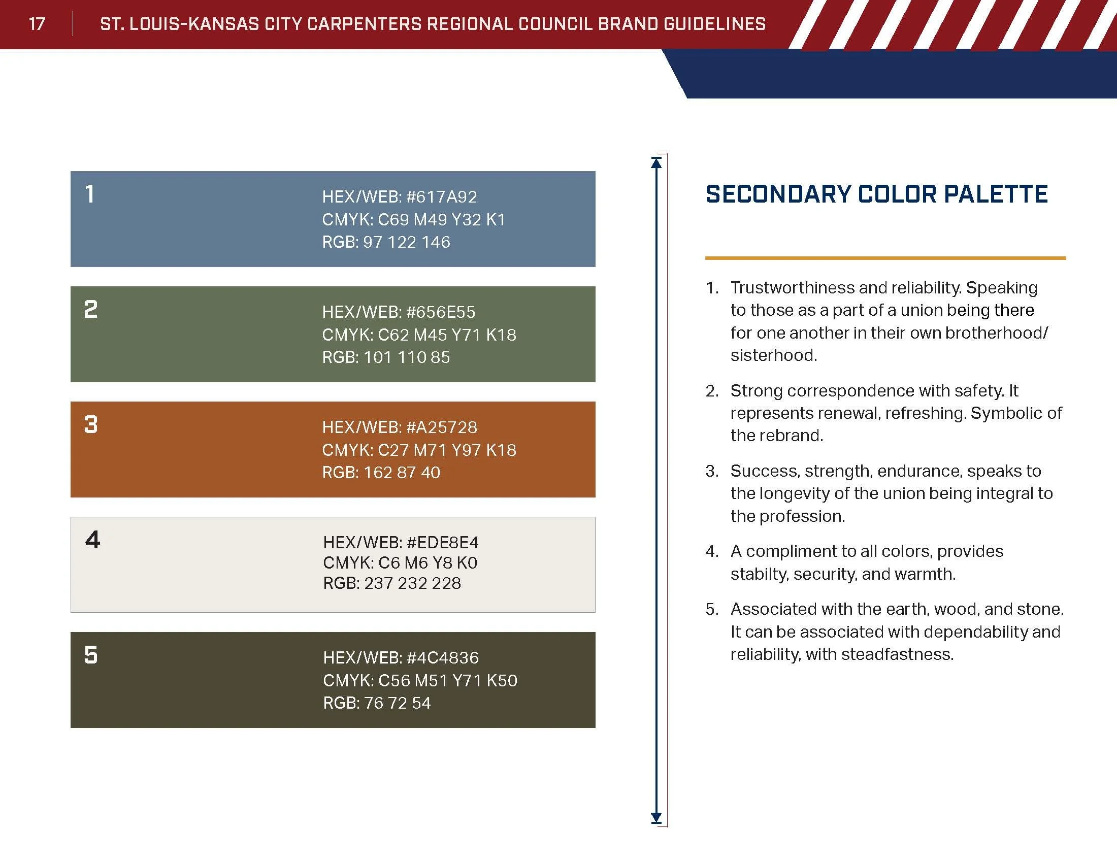
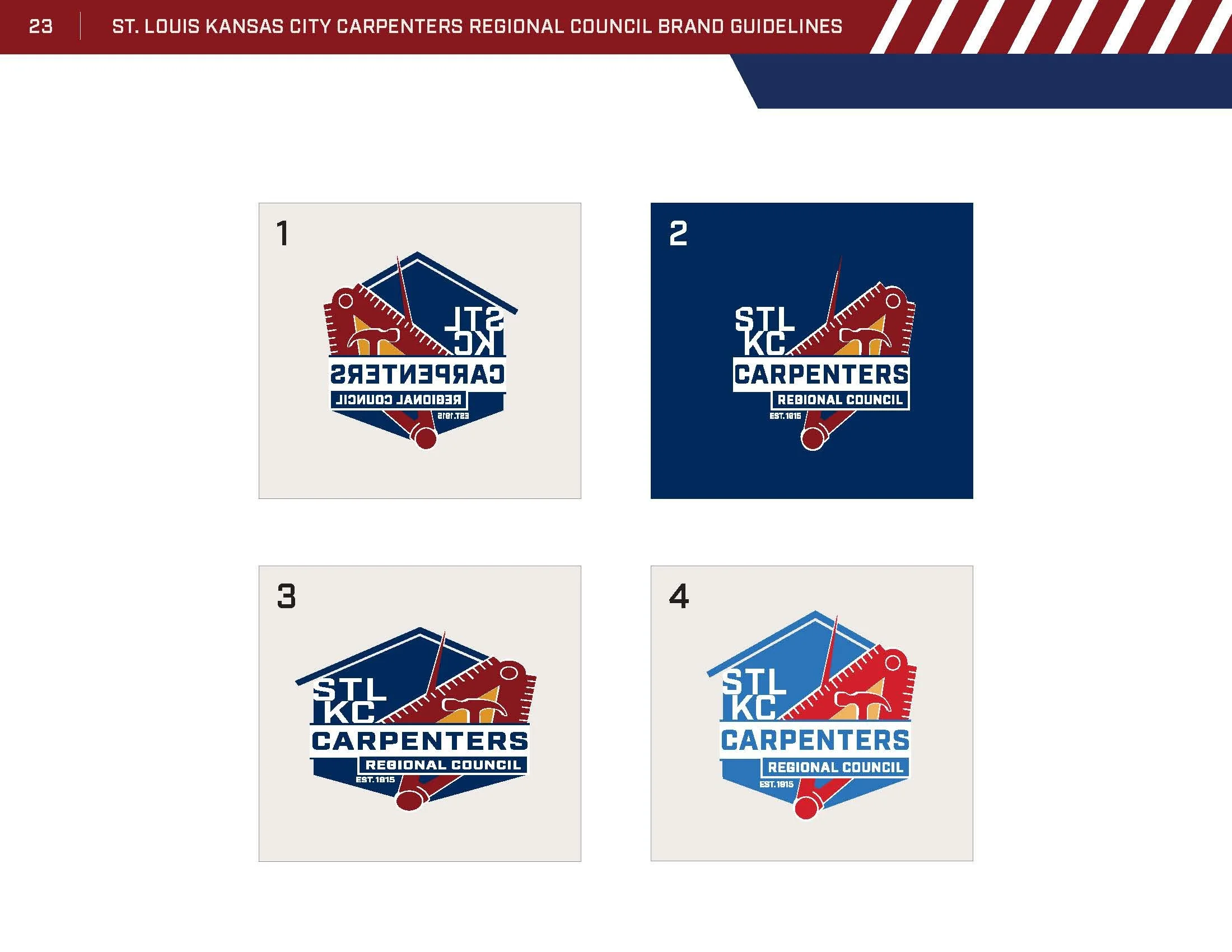
I created a guide thumbnail document to outline the most widely used standards of brand guidelines. Working backward, I populated the guide as we gathered the information, created the visuals, and established rules, and usage specifications. I started with the color palette, creating each color with thoughtfulness and insight relating to the carpentry field by providing justification for each color used. This was a win for the client relationship as he saw the care and consideration from our creative team’s side going into the brand. It persuaded him and achieved his buy-in for the colors representing the brand.
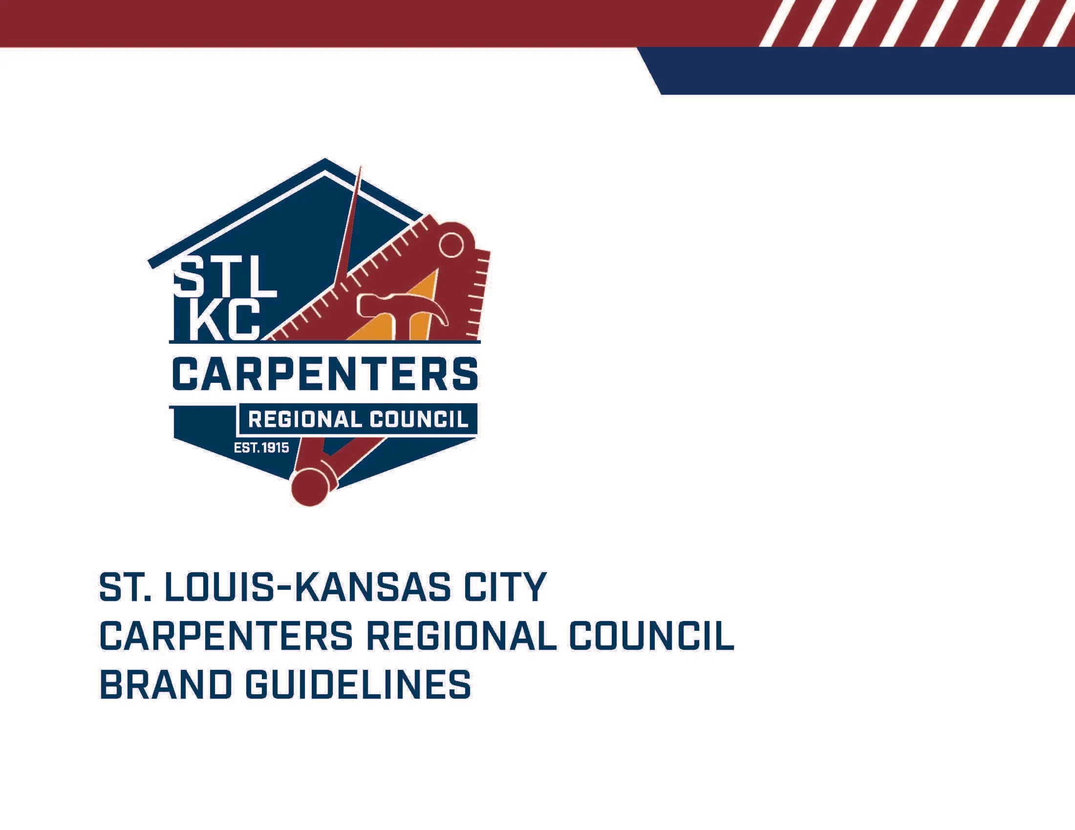
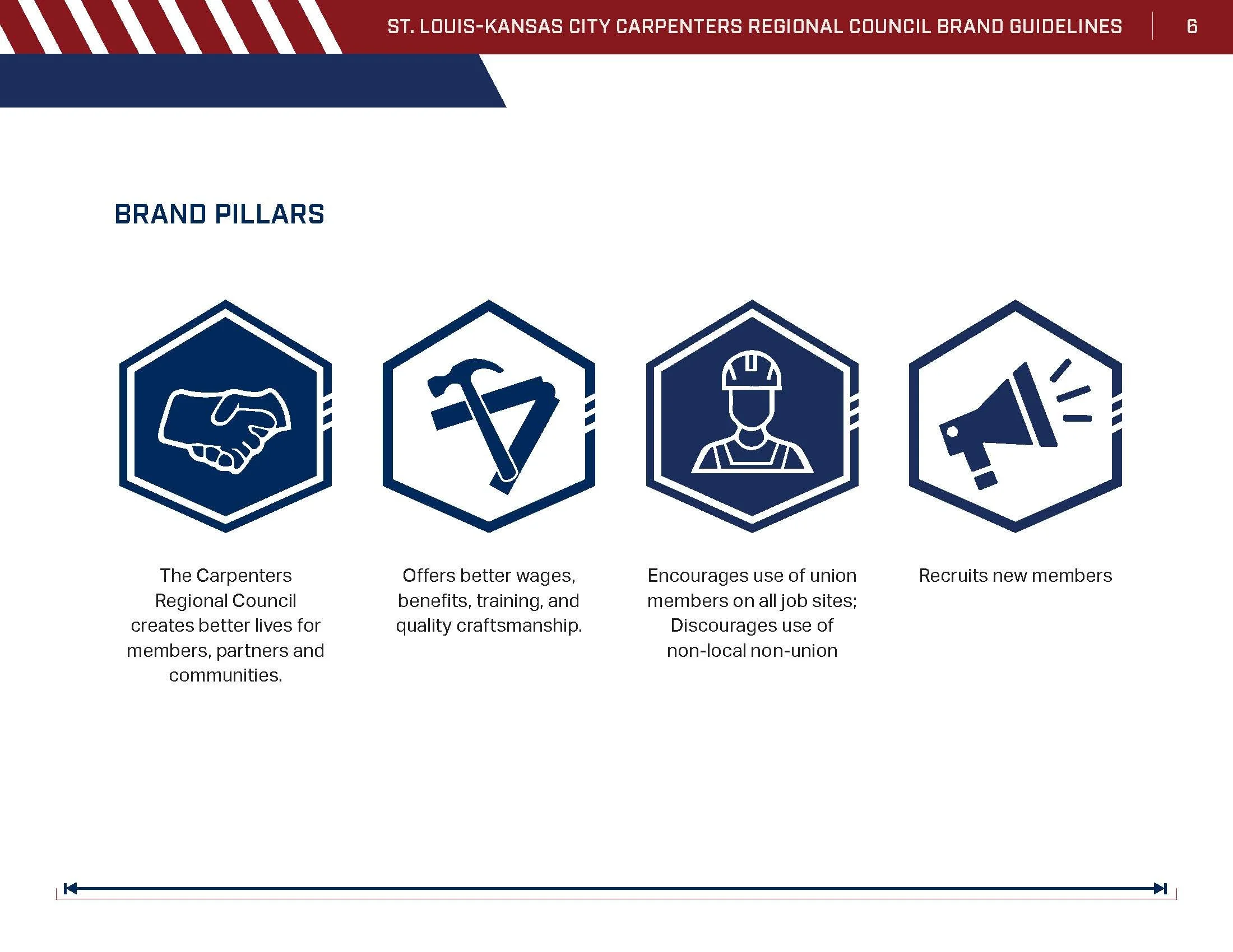
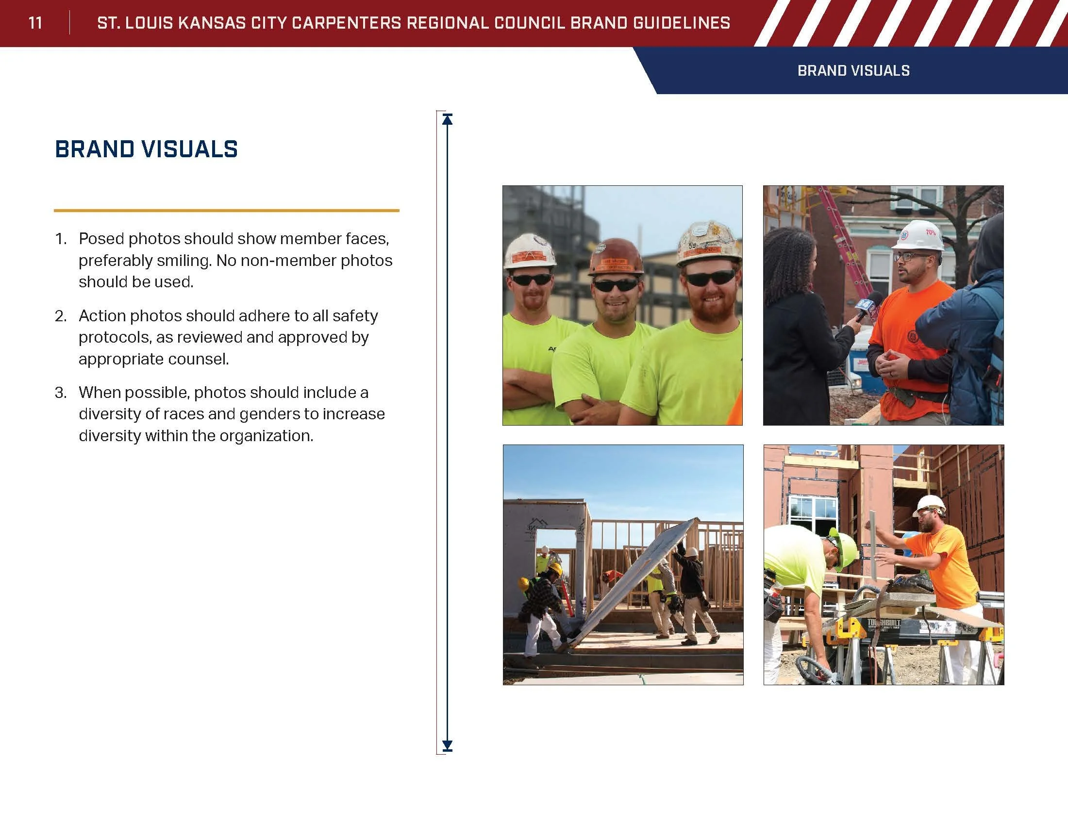
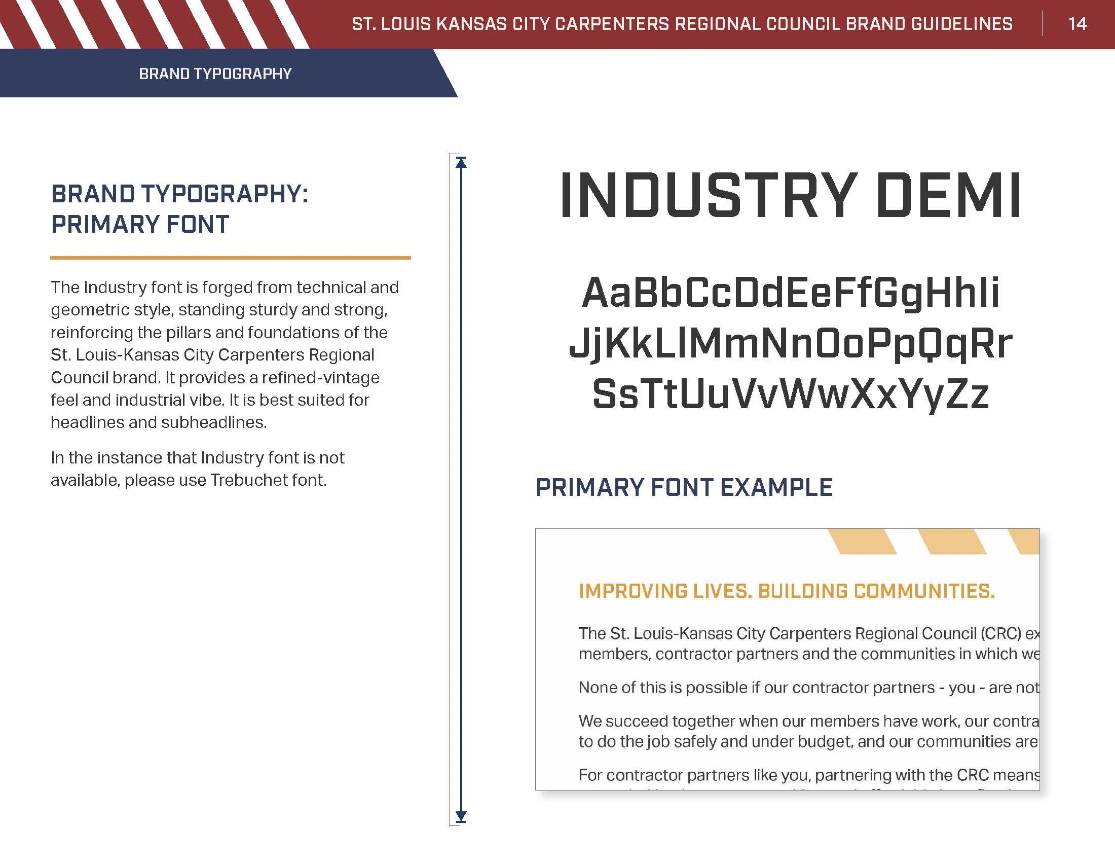
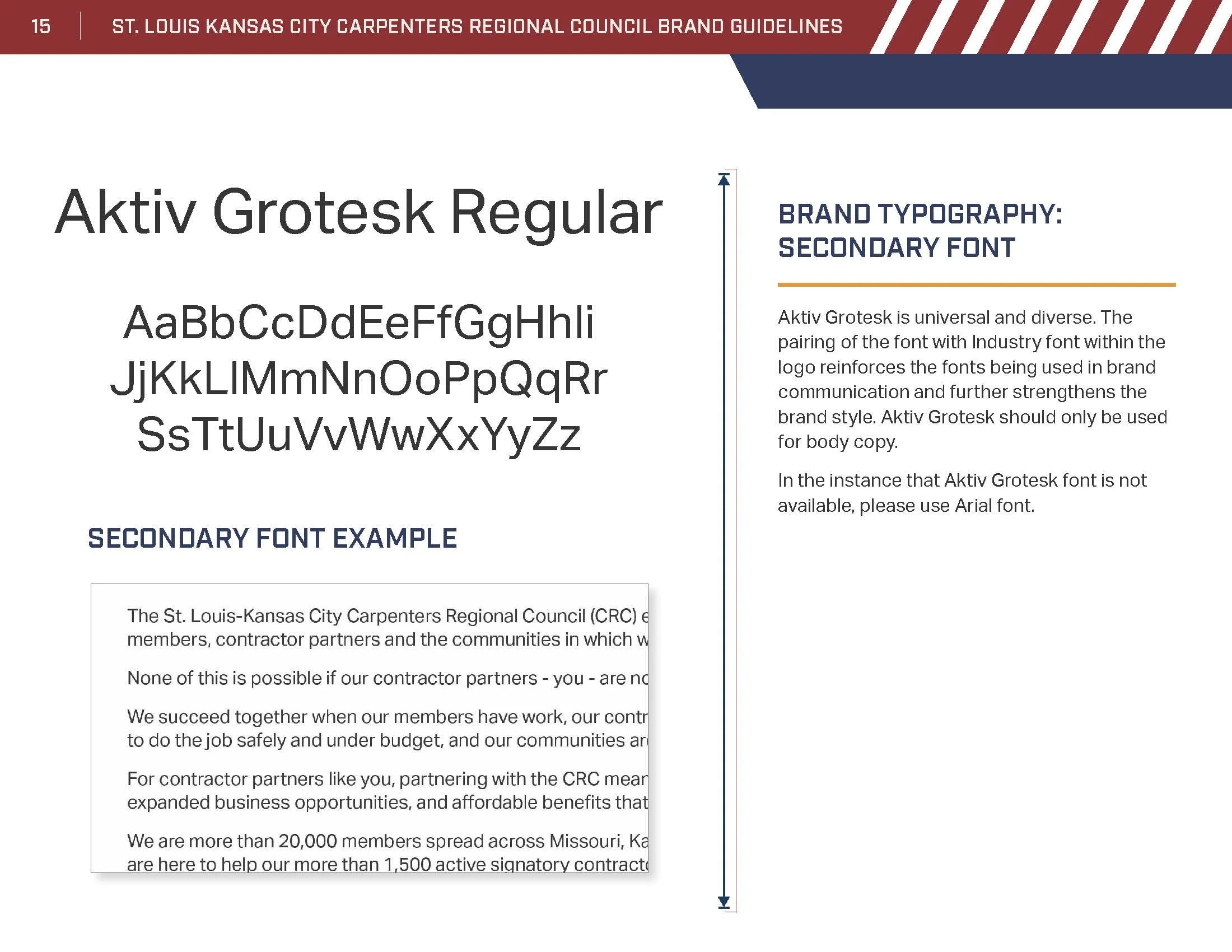
I led meetings with the client using a “brand guide content outline” that I created. This document posed questions to the client pertaining to the organization, as to help define the brand in ways that would maintain consistency and promote brand integrity in any additional marketing collateral that was created by STL-KC CRC’s internal marketing team. The final deliverable: a 36-page, all-encompassing, style and brand guide complete with rules, definitions, brand pillars and personality, typography, color palette, defined audiences, iconography, and brand visuals.
additional STL-KC CRC MARKETING MATERIALS
Some of the brochures designed for different disciplines within the council.
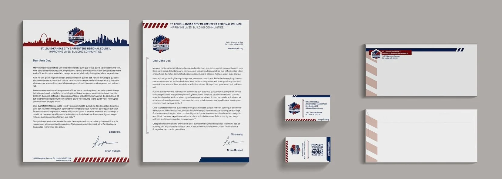
Branded letterhead, business card, and envelope.
Logo for Electrician's Apprenticeship Program.
Print ad, file prepared to provide to the client for them to use as a template for future print ads.
AbOUT STL-KC CRC
The St. Louis-Kansas City Carpenters Regional Council represented more than 20,000 members in 33 locals across Missouri, Kansas, and Southern Illinois. The Regional Council works for its members by negotiating fair wages and comprehensive benefit packages. “We believe in providing our contractors with the most productive and skilled workforce available, while offering the kind of advanced training and technology that gives us the competitive edge.”
The St. Louis-Kansas City Carpenters Regional Council merged in 2021 with the Chicago Regional Council of Carpenters to form the new Mid-America Carpenters Regional Council.
SUPPORTING Creative Team MEMBERS
Manager: Suzanne Vandling, Designers: Candice Hendrickson, Stephanie Gottbeheut, Copywriter: Josh Peters

